Tableau Conference 2025 | Know Before You Go
If you’re a data enthusiast, analytics professional, or just someone curious about Tableau’s latest innovations, the Tableau Conference 2025 is your...
8 min read
 Luke Komiskey
Jul 5, 2023

The ability to transform raw data into actionable insights is crucial for driving success. Tableau, an industry-leading data visualization and analysis platform, has become indispensable for business leaders and decision-makers to gain valuable insights from complex data sets quickly. However, truly harnessing the potential of Tableau requires understanding best practices and leveraging its capabilities effectively.
We will dig into 10 must-know Tableau tips - based on our team's experience with 150+ deployments - that will empower your organization to create impactful dashboards, optimize data performance, and foster a data-driven culture within your organization, enabling better decision-making and a competitive edge using data.
Jumping into any project without a clear goal can lead to chaos, time waste, and results that miss the mark. When it comes to creating data dashboards with Tableau, the same rule applies. Your first step should always be to outline a clear business-focused use case.
Think of a use case as your roadmap. It's a guide that keeps your dashboard development on track - ensuring that it aligns with wider business objectives. It helps you decide what data to include, how to present it, and who ultimately needs to take action with these insights.
Your use case could be anything that's important to your business. Maybe you want to streamline operations, spot market trends, predict sales, or improve customer service. It's not just about the data you have but how you're going to use it. Do you want to answer key business questions, reveal hidden insights, or tell a story with your data?
The use case you choose will also help you decide what type of chart to use in your visualization. The aim here is to make complex data easy to understand. Bar charts are great for comparing data across categories, line charts show trends over time, and pie charts break down proportions.
Remember, the power of your Tableau dashboard comes from its ability to deliver clear, actionable insights that match your business goals. So, start with a business-focused use case, and you're already on the path to success.
Jumpstarting your dashboard creation process is made easier with Tableau's pre-existing templates, known as 'Accelerators.' These templates provide a reliable starting point, enabling you to begin with a pre-configured layout, easy mapping of key fields from your source system, and then tweak it according to specific needs and preferences. It's helpful to have a starting point vs. starting from scratch.
In addition to the Accelerators, Tableau Public serves as a valuable source of inspiration. It showcases a wide array of dashboards created by users across the globe, offering the opportunity to view and learn from real-world applications. Browsing through these examples can help inspire ideas of design, metrics, and visualizations that align well with your business use cases.
The beauty of the Tableau platform is that its backed by an active community of users and experts who frequently engage in forums and social media groups. These communities found in help forums, Twitter, and Reddit create a collaborative environment where users can share challenges, offer solutions, and exchange insights, serving as a dependable support network.
Additionally, Salesforce continues to add new modules to their Trailblazer learning platform to help people skill up on data literacy and Tableau concepts easily.
When designing dashboards, resist the urge to pack them with all the data you have. It's important to remember that not all information needs to be in a single visual or dashboard. Trying to answer every business question at once can lead to overly complex visuals that are hard to interpret and may dilute your key messages.
Aim for clean, focused dashboards. Cut out any unnecessary elements that could distract from your main insights. Think of your dashboard as a clean canvas, where every piece of data is an added brush stroke. You want to make sure that each stroke contributes to the overall picture and doesn't simply crowd the space. Using whitespace wisely can greatly enhance readability and help establish a clear visual hierarchy.
Next, pay attention to your color scheme. Consistent and deliberate color choices not only align with your brand but also reinforce the story you want to tell with your data. Colors can be powerful tools for emphasizing important data points, spotlighting trends, or differentiating categories. Just remember to use them purposefully and sparingly.
Finally, make sure your key data points stand out. Your dashboard should help users quickly grasp the main insights, so techniques like highlighting, bolding, or enlarging key data points can be very effective. The goal is to draw your users' attention to the most critical information, providing them with clear takeaways from your dashboard.
A slow-loading dashboard can be a significant roadblock to user adoption and effective decision-making. It's crucial to consider your dashboard's performance during its design and maintenance phases. People generally expect swift, seamless experiences, and every extra second they have to wait for insights can impact their satisfaction and - ultimately - usage.
One practical way to enhance your dashboard's speed is to minimize the number of complex calculations it contains. If possible, try performing calculations at the data source level or use Tableau's built-in functions for improved performance. Reducing these calculations can decrease load times, providing a smoother and more enjoyable user experience.
Pay attention to your data size when designing visualizations. Larger data sets can slow down dashboard performance. Consider filtering and aggregating your data to present only the most pertinent information. One of the biggest culprits is scanning through 10+ years of sales data for last month's sales numbers. This approach can lessen the load on your dashboard and keep it running smoothly.
Lastly, don't overlook the power of Tableau data extracts for boosting dashboard performance. Data extracts are stored snapshots of your data, providing a quicker querying capability, especially when dealing with extensive or slow data sources. Using data extracts can significantly improve dashboard responsiveness, helping to meet user expectations for a fast, frictionless experience.
Establishing strong data governance is an essential ingredient in your Tableau journey. A solid governance framework provides transparency, allows users to trust their data, and ensures the right people have access to the appropriate data.
The first step in data governance involves setting up proper data access controls. Use Tableau's built-in user roles and permissions to manage who has access to what data. This step is crucial in protecting sensitive information and maintaining compliance with data privacy regulations.
Next, commit to ensuring data quality and consistency. Adopt procedures that ensure your data remains accurate, reliable, and uniform across all visualizations. Implement data validation checks to verify data accuracy and produce clear documentation that helps users understand the data they're working with. Consistent and high-quality data leads to accurate insights and boosts user confidence in your dashboards.
Finally, consider creating a data dictionary, a reference tool that defines and gives context to your key data elements. This resource will ensure everyone interprets the data in the same way, promoting consistency and clarity across visualizations. A well-maintained data dictionary can help avoid misunderstandings and ensure everyone is on the same page.
To ensure the long-term success of your Tableau deployment, it's essential to cultivate a culture that values and encourages data-driven decision-making.
Start by fostering a collaborative atmosphere where teams can freely share insights, lessons, and best practices gleaned from their work with Tableau. Internal user groups are a great way to bring together users and create momentum on adoption. The agendas can be built around showcasing internal dashboards and teaching new concepts or approaches within Tableau Desktop.
Next, make sure you're supporting your people with proper training. Tableau is a powerful tool, but its full potential is realized when users at all skill levels can confidently navigate and use it. Offering comprehensive training programs and resources will ensure that everyone, from beginners to advanced users, can effectively harness Tableau for decision-making.
Of course, ongoing support is a must. Make sure a community (e.g. email list, Slack channel, SharePoint group) exists to assist your users as they encounter challenges and learn new features. This backing not only helps them maximize their use of Tableau, but also boosts their confidence and enthusiasm.
Finally, celebrate data-driven decision-making. Recognize and reward those who actively utilize data in their decision processes. This type of positive reinforcement will encourage more of your team to rely on data, cementing your company's shift towards a data-driven culture.
To ignite curiosity and drive data exploration among your users, make the most of Tableau's interactive dashboard features. These can include filters, tooltips, and dashboard actions, each of which offers users a chance to delve into the data, ask questions, and uncover insights that are relevant to their individual needs and interests.
It's about more than just providing data; it's about providing an experience that encourages engagement and exploration. When you give your users the ability to manipulate the data themselves, you're creating a deeper understanding and facilitating more insightful discussions around data. It's why spreadsheets never go away.
Accessibility is crucial for long-term success - appreciating where and how your users can access data. That's why it's also important to ensure your dashboards are mobile-responsive, meaning they are easily accessible and fully functional on a mobile device.
Tableau's device designer feature comes in handy here, allowing you to create visualizations that are tailored for various screen sizes and orientations. This way, whether your users are on their laptops in the office or using their smartphones in the field, they'll always have access to the insights (presented in a way that makes sense for each device).
One of Tableau's strengths is its ability to connect with a vast array of data sources. From databases and spreadsheets to cloud platforms, you can use Tableau to tap into diverse data streams to extract maximum insights. Using built-in connectors and APIs, you can establish a seamless data flow right into your dashboards.
But it doesn't stop there. Integrating Tableau with other tools in your tech stack - like ETL tools, data warehouses, or advanced analytics platforms - can further streamline your data analytics processes. By creating a cohesive data analytics environment, you're making it easier for your team to access, analyze, and understand the data.
Even beyond your tech stack, consider opportunities for embedding Tableau visualizations into existing workflows. This could be through Salesforce, intranet portals, or other business applications your team uses daily. By embedding analytics right where decisions are made, you're truly integrating data into your business's everyday operations. It's not just about having the data but putting it where it's most useful and impactful - directly in front of your users.
Just like any other tool or platform you invest in, you want to make sure Tableau is being used - and used well - by your team. Keeping an eye on adoption and engagement metrics is key to understanding whether your investment in Tableau is paying off.
Monitor how often your dashboards are being accessed and by whom. Which visualizations are most frequently used? Where are people spending their time? Tableau offers built-in tracking features, or you can create custom usage dashboards to gather and analyze this data.
Remember, these metrics aren't just numbers. They're signals that help you understand how your team interacts with Tableau and how to improve their experience. They can highlight underused resources, pinpoint popular features, resolve poor user experiences, or identify training opportunities.
Use these insights to inform your Tableau strategy, enhance the user experience, and drive continual improvements in your data-driven decision-making process. After all, it's not just about having data - it's about actually getting people to use insights to make better decisions. Adoption metrics create visibility around user experience.
No one expects you to navigate the world of data visualization on your own. There are times when seeking expert support, like the services offered by Tableau Partners like DataDrive, can be beneficial. This is especially true for complex projects or when you encounter challenges that demand more advanced knowledge of how Tableau connects, visualizes, and integrates into other application ecosystems.
You can think of DataDrive as your co-pilot on this data journey. We're here to provide guidance on best practices, dashboard optimization, and personalization. Our goal is to ensure you're getting the maximum value from Tableau's features and capabilities. Don't let your investment in analytics go to waste!
Remember, learning and improving never stop, especially in a dynamic field like data visualization. There's always something new to discover, and often, the best learning comes from others in the community. Participating in Tableau events, webinars, and community user groups allows you to connect with peers and experts, exchange experiences, and pick up new skills.
These events can be a goldmine of information, helping you continuously improve your organization's Tableau proficiency. This ensures your data visualization efforts remain fresh, effective, and aligned with the ever-evolving best practices. Remember, success in Tableau isn't just about what you know; it's also about who you learn from and the community you build around you.
These 10 must-know Tableau tips can help business leaders and decision-makers unlock the full potential of Tableau and make better, data-driven decisions. By focusing on clear goals, leveraging built-in resources and community, and maintaining focusing on clear, governed insights, you can ensure that your organization reaps the benefits of Tableau's powerful capabilities. Investing time and effort in implementing these strategies can significantly improve your organization's decision-making processes and competitive edge with a new data advantage.
DataDrive has helped over 150 organizations unlock the full potential of their data with Tableau deployments - incorporating best practices for data integration, governance, and visualization to help people see, understand, and take action with data. Reach out to learn how our DataDrive team can help you unlock data-driven insights.
-2.gif)
If you’re a data enthusiast, analytics professional, or just someone curious about Tableau’s latest innovations, the Tableau Conference 2025 is your...

Tableau Plus is the new premium offering from Tableau, a leading data visualization and business intelligence platform. It builds upon the...

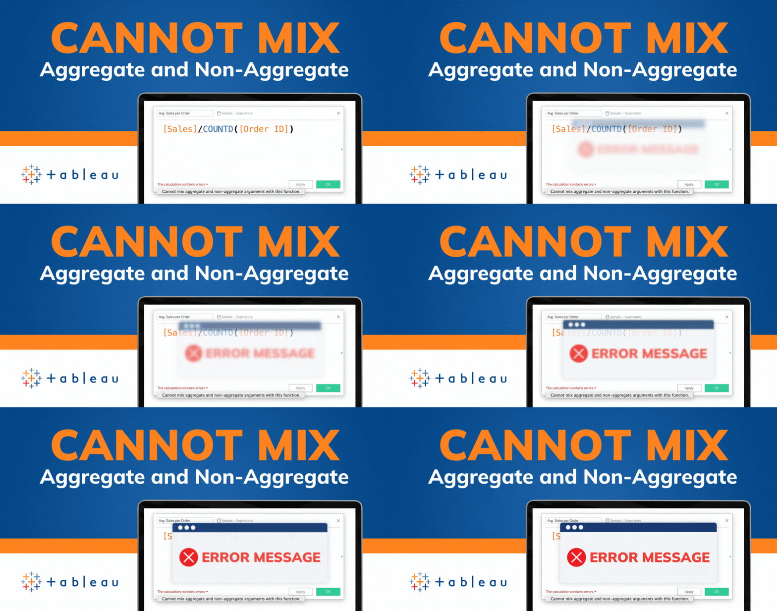
If you've spent any time working with Tableau, you've likely encountered the dreaded "Cannot Mix Aggregate and Non-Aggregate Arguments" error. It's a...