

 Tommy Ranney


Tableau Conference 2025 | Know Before You Go
If you’re a data enthusiast, analytics professional, or just someone curious about Tableau’s latest innovations, the Tableau Conference 2025 is your...
A common issue many analysts face throughout their career is breaking down data silos to bring everything together in a single report. In many cases, this is where we wind up with a Frakenstein’s Monster of an Excel workbook, with a lot of data pasted into a variety of sheets and brought together with a smattering of 'if' statements and vlookups.
While this technically gets the job done, it is neither efficient nor sustainable. There is a better way to accomplish the same outcome, using BI tools that leverage Relationship Modeling.
In this blog, I’ll walk you through how Power BI can break down data silos and bring all of your data nicely into one packaged report.
In order to understand relationship modeling, it’s crucial to understand relational databases. In a database, it’s inefficient to store the same data point across several tables. So even though you, as an analyst, want every detail of the products your company sells, along with all the order info for those products in a single table, it would be very inefficient to store the data that way in a database. This is because the same product info is probably used in a variety of different tables for other business cases. A couple could be incoming orders, warehouse supply, or warranty claims. It would be redundant and inefficient to store all product info (Category, Sub-Category, Product Number etc.) in every table, when we could just have a single value be the placeholder for all related product info.
These placeholders are called keys, and they are what is used to join tables together in SQL so you can blend any needed data together that is stored in a database. Relationships behave in the exact same way. By storing a key in a Dimension Table, we can then reference any column in that Dimension Table within a Fact Table by only having the key present natively within the Fact table. Fact tables are commonly used to store transactional data. So, think multiple lines where each one is a distinct order, but the same product can show up in the table multiple times.
Power BI’s relationship modeling allows us to easily implement these strategies to combine data across a variety of sources into one report. Let’s dive in and see how it works.
Our relationship model will bring orders, shipping information, and product information into the same report. In this example, all three of these data points are stored in separate tables
I’ll use the column ProductKey in the tables below as an example of how this works.
Table: FactOrders
Table: DimProduct
The table DimProduct has every unique product that exists for the company. It also stores the cost, sub-category, and description. There is also a column called ProductKey. This key is a unique identifier to each product, and is used in other tables that reference a product (for example when the product is listed on an order in the FactOrders table).
Setting up the relationship between the two tables in Power BI is very simple and intuitive:
Go to the relationship tab in Power BI desktop and click edit relationships. That will pop open the below interface where you can choose the 2 tables you wish to relate, what kind of cardinality you wish to have, and the filter direction. In this example, there is a many-to-one relationship because products are listed across multiple orders, but are only listed once in DIMPRODUCT. I also set the filter direction to single. The reason I did this is so I can relate DIMPRODUCT to as many tables as I need without worrying about circular dependencies.
Now that we’ve related DIMPRODUCT to FACTORDERS, we can move on to a viz that leverages product and order data together!
The below graph compares sales (coming from FACTORDERS) through the product hierarchy (coming from DIMPRODUCT). Since the tables are related, Power BI knows how to categorize each bucket, and you can drill up and down through the layers of data you add to the viz. It doesn’t get much easier than that!
Let’s review an example of one of the most valuable relationships I think you can make: relating dates.
Many analysts know that dates can be tricky to work with, especially when there are two separate date fields you’re trying to compare to each other. In this example workbook, I have both ShipDate and OrderDate within the FACTORDERS table.
If I wanted to compare how many dollars shipped and how many dollars were ordered in a single month, I can’t use either of those date fields to accomplish it because an item can be ordered and shipped in completely different months. So let’s dive in to how we can tackle this problem with some simple DAX tables.
First, let’s build a calendar of all the distinct dates in this dataset. I’ll do that by going to the table tab, selecting New Table, and pasting the below code:
DIMDATE = CALENDAR(MIN(FACTORDERS[ORD_DATE]),MAX(FACTORDERS[SHIP_DATE]))
What the Calendar function does is produce a row for every date between the two inputted values, whether or not that date existed in the dataset or not. So, for the above, I’m creating a calendar that goes from the first order date until the last ship date.
Note that more often than not in real-world examples, I’m using the TODAY function as the max date, but the sample data I used had a clear end date so I put that in instead for this purpose.
Using the same method we did with relating DIMPRODUCT to FACTORDERS, let’s relate DIMDATE to FACTORDERS on ORD_DATE = Date:
We’re now able to summarize any order info on our newly created calendar! But we still have to solve for shipping info because on a date basis, all of FACTORDERS will be summarized by the order date when using our calendar table.
Let’s write one more DAX table to solve for this using the below:
SHIP_INFO =
SUMMARIZE(FACTORDERS,FACTORDERS[ORDER_ID],FACTORDERS[SHIP_DATE],FACTORDERS[SALES],FACTORDERS[ProductKey],FACTORDERS[QTY])
What the SUMMARIZE function is doing here is the exact same thing as a group by clause in a SQL query. The output will be a table that has a distinct combination of all the values selected from FACTORDERS.
Let’s now relate SHIP_INFO to DIMDATE on SHIP_DATE = Date, and VOILA! By using DIMDATE’S date field on an axis, we can now have a shipping and order summary in one chart:
You can also relate the SHIP_INFO table to DIMPRODUCT and have each bar accurately slice in accordance with all of your product info.
In addition to summarizing dollar amounts or quantities in a month, having the data structured this way can make it easier to do other helpful things like calculate how many open orders or dollars you have at any point in time to showcase when backorders become a problem. But we can dive further into that DAX another day.
That’s all there is to relationship modeling in Power BI. All of your data doesn’t even need to live in the same database to use this strategy. As long as you can create the link between two fields, your report can pull from a lot of separate sources.
If you understand SQL, or even just vlookups in Excel, this should be an intuitive concept to grasp. Use this knowledge to build out an entire data model within Power BI! Before long, you’ll have one built that might even look like Charlie Kelly solving the Pepe Silvia conspiracy.
In the event you need to untangle that mess, reach out to me. I’d love to help you out!

-2.gif)
If you’re a data enthusiast, analytics professional, or just someone curious about Tableau’s latest innovations, the Tableau Conference 2025 is your...

Tableau Plus is the new premium offering from Tableau, a leading data visualization and business intelligence platform. It builds upon the...
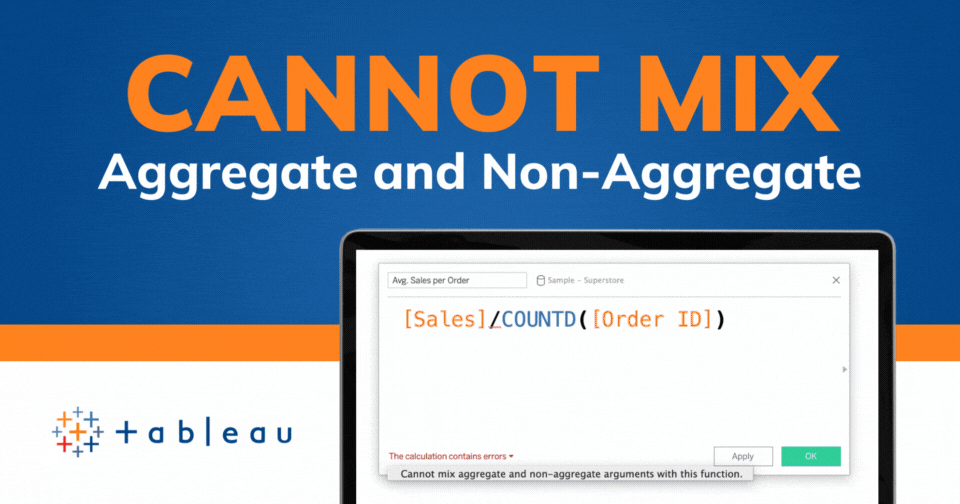
If you've spent any time working with Tableau, you've likely encountered the dreaded "Cannot Mix Aggregate and Non-Aggregate Arguments" error. It's a...