Tableau Conference 2025 | Know Before You Go
If you’re a data enthusiast, analytics professional, or just someone curious about Tableau’s latest innovations, the Tableau Conference 2025 is your...

Leading up to the 2020 NBA Draft, I shared a Tableau Public visualization called NBA Draft Gems, where a user could explore several statistical categories for players drafted into the NBA over a fifty-year period and find the “gems” within each draft class. A gem was simply designated as the category leader within each draft class. You can see the final visualization below.
As I built out this visualization the need to guide the user through the process of consuming it became very apparent. However, I am one for clean visualizations, so my goal was to limit the amount of text on the viz itself. To achieve this, I leveraged a floating layout container with a Show/Hide button, a technique I first saw used by Tableau Zen Master, Marc Reid, in this blog post from March of 2019. This post will walk through the process of creating this annotation layer for which I was pleasantly surprised to get such positive feedback once I shared the visualization in the Twitterverse! You can see the annotation layer below.
It’s worth noting that the process shared below was done using Adobe Illustrator. However, this could also be achieved using Figma, PowerPoint or whatever your tool of choice is for building out and bringing custom images into Tableau.
First, we want to take a screenshot of the viz and bring that image into Illustrator. We’ll start a new document in Illustrator. To do this, navigate to File → New and the below window will pop up. This allows you to set the size of your art board. Select Custom, set your Width and Height to the exact size of your Tableau dashboard (100px in Tableau = 1 inch in Illustrator) and then click Create. Our NBA Draft Gems dashboard is 1000px wide by 700px tall, so we’ll set our art board to 10 inches wide by 7 inches tall.
Now that we have an artboard, we’ll place our screenshot image on it by navigating to File → Place, finding our screenshot image and placing it on the artboard as the exact same size...in our instance 10” by 7”. Next, we want to dial down the opacity, which helps push the dashboard to the background and let the annotations pop. You can see in the image below, I’ve set the opacity to 50%. Alright, we’re cruising right along and already set to add in the annotations!
Each annotation box has four pieces to it. I made the first then copied each piece four times to create the other four. First we’ll want to use the Rectangle Tool to drag a rectangle onto the view. To give it rounded edges, we’ll navigate to Effect → Covert to Shape → Rounded Rectangle.
This will give us the following dialogue box. We’ll set the Extra Width and Extra Height back to 0.00 in and leave the Corner Radius at 0.125 in, then click OK. For more rounded edges, simply bump up the Corner Radius. Knowing about where the other four annotations would wind up, I copied this rectangle four times and dragged them into place.
Next they needed text, so I used the Type Tool to drag a text box onto the view, typed up my first annotation and just like with the rectangles, repeated this process four more times. That brought us to the view below.
At this point it started to feel like we were getting somewhere, but there was one huge piece still missing. We couldn’t assume the user would know what order to read the annotations in, so I used another shape tool, this time the Ellipse Tool as well as the Type Tool again for more text boxes. This would allow me to add numbers to the upper left-hand corner of each annotation. And now the annotation layer looked like this.
We’re so close! Almost there and actually this view would get the job done, but from a design perspective it’s pretty blah and doesn’t have any sort of flow to it. So, I decided to draw out the path, connecting the annotations to help guide the user through the experience.
In the final step of building the annotation layer, we’ll use the Curvature Tool to draw curved lines from one box to the next, connecting the boxes so the user can seamlessly move from one to another. To create the dotted lines, click on the curvature tool, move your cursor to where you’d like your dotted line to begin and click to create a series of dots. The tool will connect the dots, creating a curved line in the process. When you’re done with a line click back on the Selection Tool. At this point, you’ll have a line that looks similar to the line in the image below.
With a few steps, we’ll turn this into a slick dotted line.
For my annotation layer, I checked Dashed Line and played around with the settings a bit until I landed on what looked good. I ended up going with Dash = 12pt, Gap = 5pt and selected an arrowhead that would help point the user in the right direction.
Our annotation layer is complete! Now we just need to create a couple of buttons and then bring the annotation layer, along with the buttons into Tableau. If you’ve never created buttons before, this YouTube video by Tableau Zen Master, Kevin Flerlage, is fantastic. Kevin and twin brother and fellow Tableau Zen Master, Ken Flerlage have even gone a step further with this Tableau Public workbook in which they’ve created 130 buttons with different styles and purposes. These are all available for download to help make your life a little easier.
To add the annotation layer to Tableau, bring a floating vertical or horizontal container onto the dashboard, click the dropdown and select Add Show/Hide Button.
Next, click the dropdown again and select Edit Button. The dialogue box below will appear and within it we’ll want to set the appropriate button to be displayed on the dashboard when the annotation layer is hidden and when it’s shown. Once the buttons have been selected, we’ll click OK.
Now, we’ll place the button where we want it on the dashboard, size it and then set the floating layout container to the size of the entire dashboard; X = 0, Y = 0, W = 1000, H = 700. Take a minute to make sure the action of opening and closing the container works and lastly you’ll want to ensure your buttons are brought to the front of the dashboard, so they don’t disappear behind the container when it’s opened. To do this, click the dropdown, select Floating Order → Bring to Front.
BOOM!! We’ve just created a clean annotation layer that can be used to help the user understand what is going on in your Tableau visualization. Here’s the final annotation layer one last time.
Thanks for reading, I hope you found this helpful. Feel free to reach out to me on Twitter at @JtothaVizzo if you have any questions or would like to connect.
-2.gif)
If you’re a data enthusiast, analytics professional, or just someone curious about Tableau’s latest innovations, the Tableau Conference 2025 is your...

Tableau Plus is the new premium offering from Tableau, a leading data visualization and business intelligence platform. It builds upon the...

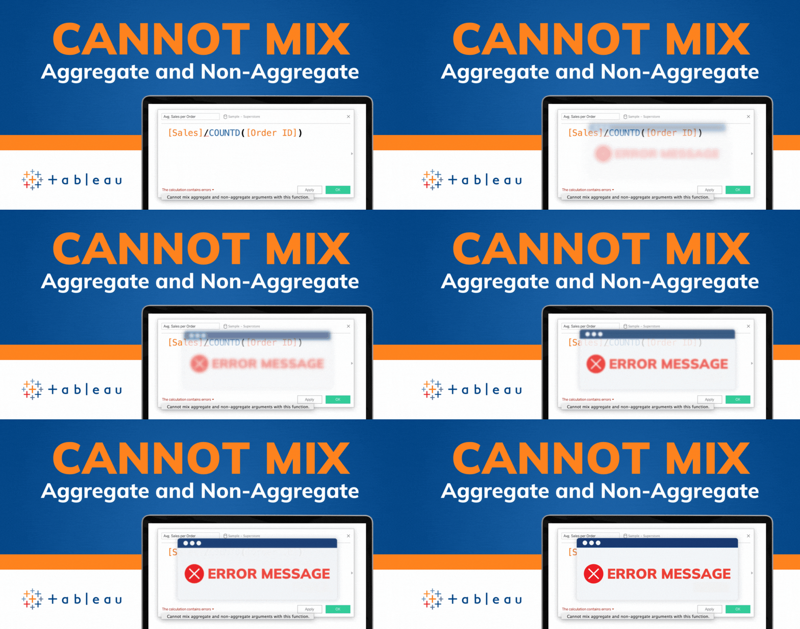
If you've spent any time working with Tableau, you've likely encountered the dreaded "Cannot Mix Aggregate and Non-Aggregate Arguments" error. It's a...