

 Mahzabin Khan
Tableau Conference 2025 | Know Before You Go
If you’re a data enthusiast, analytics professional, or just someone curious about Tableau’s latest innovations, the Tableau Conference 2025 is your...
Ever wonder how people make those awesome-looking Tableau dashboards with rounded edges and a drop shadow effect that makes containers look 3D? There are so many cool dashboard designs that I see day to day that I found impossible to recreate within Tableau. After much searching, I have finally uncovered the answer!
In this blog, I will walk you through how to make a basic custom background image for your dashboard using Figma in five easy steps! Figma allows users to design images that can be used as your dashboard background to give that extra aesthetic touch! Follow along to recreate the look!
Before we jump in, go to Figma and sign up for free!
Ideally, prior to building anything in Figma, you should create your Tableau visuals and imagine how you want to lay them out on your dashboard. For example, I have connected to Salesforce opportunity data and created a few simple visuals. Then, I created a rough dashboard layout using those visuals. I also jotted down what size I wanted my dashboard to be.
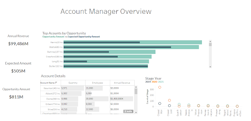
Looking at the draft layout, I can see that I need six containers that will hold my visuals. Now I know how I want to design my background image!


Now, log in to Figma and create a new file to design. Click the rectangle image in the upper left corner and select rectangle.
.png?width=346&height=255&name=unnamed%20(1).png)
Then, click and drag to create a box. Once you make your initial box you will see a list of custom edit options on the right pane. This is where you can adjust the size of the box, select colors, and add shadows!
.png?width=428&height=440&name=unnamed%20(2).png)
In the above image, you can see the adjustments I have made. I changed the width and height according to my dashboard and added a measurement of fifteen for my corner radius. This gives the box nice round edges. The higher the number, the rounder the edges.
I have changed the fill color to white, but you can adjust this color freely or use hex codes. Then, I added a stroke to get a grey border around the box. Lastly, I added some effects. When you click effects it automatically adds a drop shadow. I also wanted to add an inner shadow, so I clicked the "+" sign next to the effects. This automatically adds another drop shadow. To change it to inner shadow, click the dropdown to see other options and choose inner shadow.
.png?width=284&height=215&name=unnamed%20(3).png)
The shadows the program default to look a little harsh, so I wanted to blur them out more. Click the sun icon next to drop / inner shadows and change the blur level to ten.
.png?width=451&height=215&name=unnamed%20(4).png)
We now have the base of the dashboard ready! Next, we can create the title box in the same way.
Select the rectangle image on the top left corner and click rectangle. Click and drag to make a title box within your base box. Again, you will see a list of edit options for your title box in the right tool window.
I have made some adjustments to my title box accordingly, and this is what it looks like now!
.png?width=668&height=383&name=unnamed%20(5).png)
Notice how the title box has round edges on the top left and right corners but not on the bottom corners? You can adjust which corners should be rounded by clicking the independent corner options next to the corner radius.
To add a logo, make a box where you want your logo to be. Then select place image under the rectangle. Choose your logo and place it in the box you created for the logo. Then, click the logo and change from fill to fit under the fill option.
.png?width=364&height=259&name=unnamed%20(6).png)
.png?width=641&height=347&name=unnamed%20(7).png)
I added a line under the title box using the line option under rectangle. Then I added the title name using the text option next to the rectangle. Here’s what it looks like now!
.png?width=540&height=387&name=unnamed%20(8).png)
To create smaller boxes for your vizzes, use the same methods mentioned above. Once you create a single box, you can ctrl-c to copy and ctrl-v to paste the same box. This will save a lot of time and effort! You can also shift-click multiple boxes to make adjustments to a group. This will also help make sure the distance between each box is aligned.
Here is my final look!
.png?width=619&height=445&name=unnamed%20(9).png)
Click export from the right pane and it will automatically save as a png!
.png?width=338&height=311&name=unnamed%20(10).png)
Create a dashboard in Tableau and upload the image you saved from Figma in a titled container. Make sure to fit and center the image in Tableau. Also, get rid of any inner and outer padding.
.png?width=323&height=358&name=unnamed%20(11).png)
Now, for the last step, import your visuals as floating and place them accordingly on top of the Figma image!
.png?width=605&height=414&name=unnamed%20(12).png)
And there you have it! I hope this gives you a general idea of how you can amp up your Tableau dashboards. Use these simple techniques to add more layers and designs for a more intricate view!
If you’re interested in learning about how I connected to Salesforce data from Tableau, check out this blog!

-2.gif)
If you’re a data enthusiast, analytics professional, or just someone curious about Tableau’s latest innovations, the Tableau Conference 2025 is your...

Tableau Plus is the new premium offering from Tableau, a leading data visualization and business intelligence platform. It builds upon the...

If you've spent any time working with Tableau, you've likely encountered the dreaded "Cannot Mix Aggregate and Non-Aggregate Arguments" error. It's a...