

 Jeff Plattner
Tableau Conference 2025 | Know Before You Go
If you’re a data enthusiast, analytics professional, or just someone curious about Tableau’s latest innovations, the Tableau Conference 2025 is your...
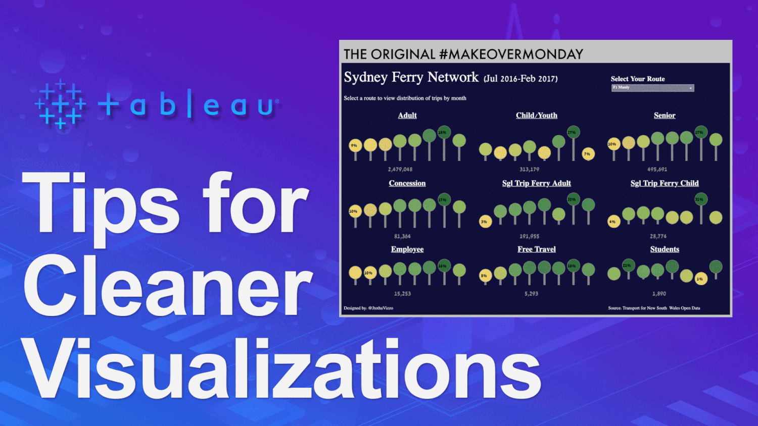
On April 30th, 2017 I published my very first Makeover Monday visualization to Tableau Public. It wasn’t good, but that’s ok, because what mattered was that I found the courage to put myself out there. Andy Kriebel, Eva Murray and the Makeover Monday project deserve a TON of credit for my growth over the past few years. Every now and then I enjoy scrolling back through my Tableau Public portfolio to see my progress. In a recent scroll through it occurred to me just how long it took for me to begin implementing some concepts that are now second nature; consistent font choices, using color with a purpose, leveraging the formatting pane and creating white space.
With 2021 finally here, many have set their goals for the year and part of this includes participation in various Tableau community projects, such as Makeover Monday. With that in mind, I thought it might be fun to go all the way back to that first, hideous Makeover Monday of mine and give it a different kind of makeover. Instead of working to improve the chart and analysis (which, by the way, is also sorely needed), we’ll leverage the four areas mentioned above to demonstrate how with just a little focus we can vastly improve the look and feel of our visualizations.


Consistent font choices can do a great job of guiding the user through your visualization. When choosing a font, stick to one legible font and use no more than four size variations. When I downloaded the workbook of my original Makeover Monday viz and saw the font I chose was Raanana, I actually laughed out loud…for real!! To make matters worse, I used the Raanana font in EIGHT...yes EIGHT different sizes within the visualization! On the plus side I did stick with just the Raanana font throughout the entire dashboard, so yay me!
For our makeover, we’ll use the Tableau font family. Unless I’m bringing in a non-supported font as an image, I almost always stick with the Tableau font in my visualizations. Throughout the viz, we’ll use four different sizes; 24pt for the main title, 12pt for the header text we’ll add within the main visualization and then 10pt and 8pt everywhere else. We can already see below how much easier the Tableau font is to read than Raanana.

For more on using fonts in Tableau, check out “How to use fonts in Tableau?” by Tableau Public Ambassador, Judit Bekker.
Color choice is vital in creating a consistent look and feel. When looking at my original MakeoverMonday visualization, it’s clear I had not yet learned that lesson. It appears as though I tried to leverage color in the lollipop charts, but the gradient color palette is redundant to the information the chart itself already tells us. Additionally, there’s no legend to help the reader understand what the colors even mean. Furthermore, the white, gray and black text definitely do not result in a consistent look. And lastly, although I am a fan of dark backgrounds, the dark blue background is unnecessary.
We’ll begin correcting these issues by making a few simple changes. First, we’ll trade in the dark blue background for a light gray one. This enables us to use the dark blue color in more meaningful ways throughout our viz. We can also add a parameter (we’ll call it p.Select Month) that lets the user select the month they want to focus on. Then we’ll write a boolean calculation saying [p.Select Month] = [Month], drop it on color, set TRUE to our dark blue color and FALSE to light gray. Now, the lollipop charts will display as dark blue for the selected month, while the other months will be sort of pushed to the background with a light gray color, thus no longer distracting the user the way the yellows and light greens were. Alright, we’re making some progress. The visualization already has a cleaner look and feel. Next, we’ll focus on formatting and white space.

To gain an in-depth understanding of how to use color in your Tableau visualizations, check out “Color Your Viz” by Dilyana Bossenz.
There’s plenty that can be done from the Formatting Pane in Tableau. If you’re newer to the tool, you’ll find it worthwhile to create a chart or table and spend some time just playing around with the different options in order to gain a better understanding of what features change what within the view. It can be difficult to see what changes when all the lines are thin and gray, so my co-worker and Tableau wiz, Brad Werner, offers this tip; “make it big, make it bold, make it red (or some other color). It is easy to tell the difference between an axis ruler and an axis tick when one of them is huge and purple!”
In my original MakeoverMonday visualization, it looks like I actually did an ok job within the formatting pane; turning off many of the default settings such as row/column dividers, grid lines, axis ticks and axis rulers. However, I probably should have kept the zero lines, so we’ll add those back in. Additionally, we’ll size down the lollipops and adjust the labeling, so the percent of total displayed is for the selected month only. Finally, we’ll add a floating dark blue text box to split up our title from the visualization and then clean up the filter and parameter.

Of the thirteen sheets on the original visualization none of them had any inner padding and I actually had taken away some of the default outer padding for whatever reason. Today, I consider padding, especially inner padding, to be one of my favorite features in Tableau.
A wise person once said “Whitespace is like garlic. When you think you have added enough, double it!” We’ll add a generous amount of inner padding to each of the sheets within the visualization. After playing around a bit, we landed on 24px of inner padding on the top and bottom of each lollipop chart sheet, with 36px on the left and right of each. I cannot stress this enough...give your visualizations room to breathe, do not be afraid to use padding and lots of it!!

For more on creating white space in your Tableau visualizations, check out “Dashboard Element 5: White Space” by Tableau Zen Master and author of Innovative Tableau and Practical Tableau, Ryan Sleeper.
Our original MakeoverMonday is looking much better, but a few tweaks are still needed;
The small multiple lollipop charts all blend into the gray background. That doesn’t look great, so we’ll color each worksheet white to let them stand out from the background.
It feels like the gray circles on the lollipop charts should be smaller than the selected, dark blue lollipop. To fix this, we’ll throw our Selected Month calculation from earlier onto the size card of the circle and then adjust the sizing of the TRUE and FALSE values until we’re satisfied.
I thought we had enough inner padding, but now that the gray lollipop charts are smaller, we’re going to bump up the left/right inner padding from 36px to 48px.
Filter/parameter - These look a bit sloppy, so we’re going to add a dynamic header above the lollipop charts and shrink down the width of the filter and parameter so the user only sees the dropdown arrow.

There we go, our final touches help tie it all together. I hope you enjoyed reading and that you’re able to apply some of the above concepts into your next Tableau visualization whether it be on Tableau Public or a dashboard built for the business world. Thanks again for reading and have a great day!
-2.gif)
If you’re a data enthusiast, analytics professional, or just someone curious about Tableau’s latest innovations, the Tableau Conference 2025 is your...

Tableau Plus is the new premium offering from Tableau, a leading data visualization and business intelligence platform. It builds upon the...
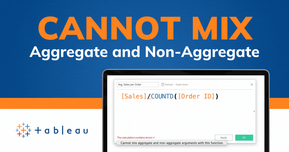
If you've spent any time working with Tableau, you've likely encountered the dreaded "Cannot Mix Aggregate and Non-Aggregate Arguments" error. It's a...