Tableau Conference 2025 | Know Before You Go
If you’re a data enthusiast, analytics professional, or just someone curious about Tableau’s latest innovations, the Tableau Conference 2025 is your...
One of my favorite things about our team here at DataDrive is that everyone, from the very beginning, has understood one very important thing: the true focus of every data initiative is not really the data at all, it’s the people on the other side of the screen that will be using the data to do something impactful like make a decision, change a mind, check their intuition, or even reveal a hidden truth.
Which is why, from day one, DataDrive has built our core delivery methodology around the Human Centered Design and Design Thinking frameworks to make sure that our solutions wouldn’t just be technically and logically sound, but also actually get used by the people who need them the most. We lovingly refer to it as Human Centered Data™.
It is the DataDrive way. Let’s talk about what that means:
Our core process resides around the fact that the first step to every great project is making sure we truly understand the real need of the person asking for help, and getting crystal clear with clients on who the audience truly is (those who will actually be using the tool, not just those helping to make it or those managing the development process). Once we’ve established the true audience, we then spend more time than one might expect really digging and empathizing with those users, often using a tool called an Empathy Map to better articulate the different aspects we want to consider:
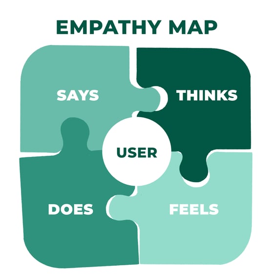
By not cutting corners at this step, we’ve seen time and time again that we end up designing solutions that align much more closely with true needs of our clients (not just what they say/think they need), and allows us to better translate end-user needs into impactful data experiences. We shouldn't burden our users with trying to translate their own needs into the technical solution requirements needed to meet those needs.
Phrasing needs in natural terms without bending them into the language or constructs of the available technology/solution can do wonders for you, especially when you start running into seemingly conflicting technical requirements. It allows you to go back to ‘okay, what are we really trying to accomplish here?’ and often find an alternative path that can satisfy the root needs in a harmonious way. Let your users speak in their own tongue, don’t force them to try to speak yours.
It’s also worth noting that this approach really should apply to the entire data pipeline, not just the pieces that an end-user will experience directly. By starting with the end in mind, we ensure all components of the pipeline align to orchestrate the best possible outcome.
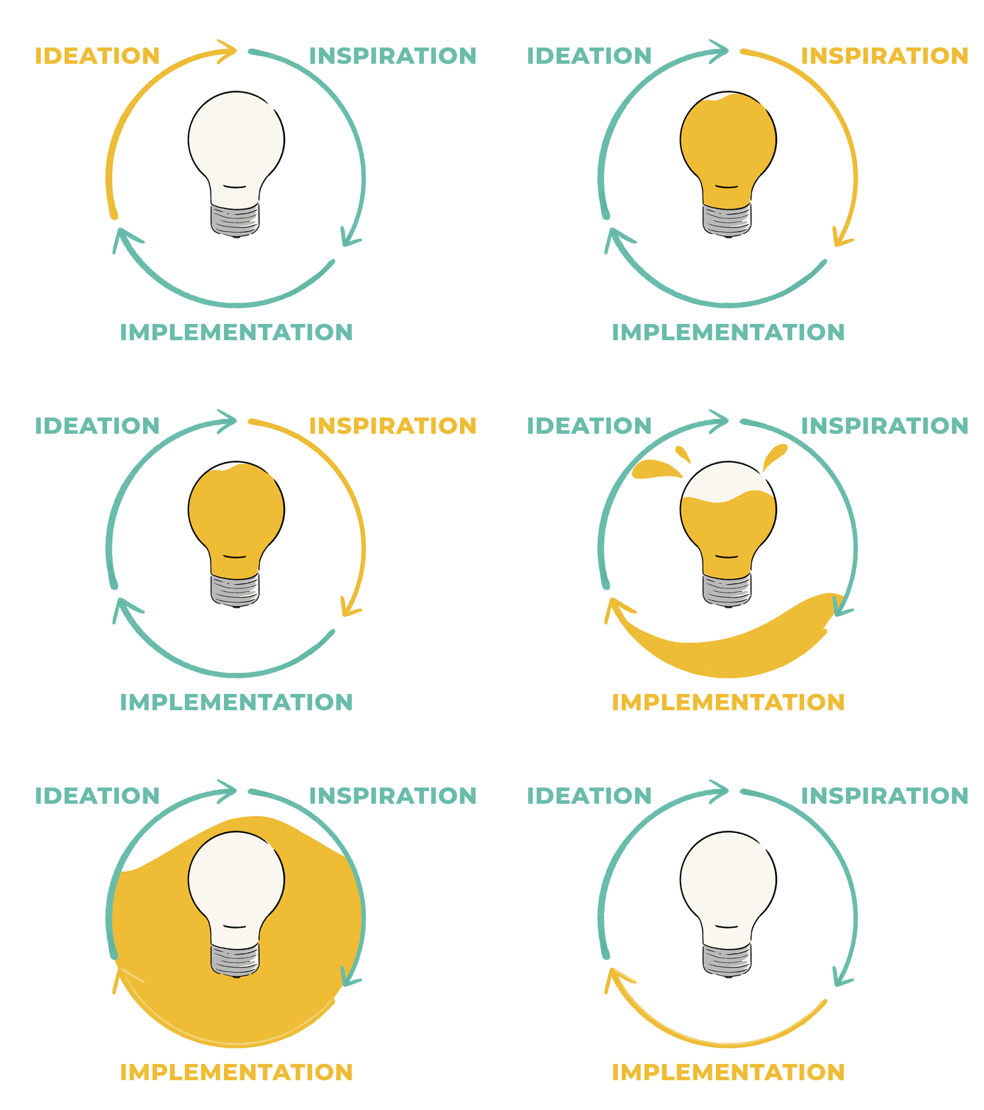
So how does all this apply to the creation of a data product or solution? One of the biggest factors that leads to successful data solutions for our clients is the way that the Human Centered Data™ approach seeks to push the questions often associated with user experience design from the interface portion of a project (read: the end) to the very start of a project instead. User experience design has often been something traditionally saved for the very end of a project (after all the data pipelines have been built, models tested, and tables written, treating design as the ‘wrapper’ to the delicious data candy underneath) rather than a foundational element of the entire process.
Design Thinking pushes design down into the very fabric of the solution, from conception to launch, meaning your dashboard/report/user interface designer won’t be left trying to connect dots for the end user that will never really come together in the way that users need them to in order to derive useful insights. The collection of the data, the subsequent modeling and enriching, and the final delivery of that data via dashboards, reports, or applications to the end-user all get aligned around delivering on a common goal, grounded in the needs of your user.
The beauty of the process itself is that it actually makes our lives as developers EASIER, even though it appears to involve more work on the surface. By leveraging a cyclical process of hearing, dreaming, building, testing, and repeating, the process allows us to learn faster and adapt our first drafts into final products (that actually get approved and adopted) in record time. Through these iterations, we arrive at something the users basically designed for themselves, we’re merely ‘revealing’ the sculpture already hiding inside the clay by applying our craftsmanship.
A critical part of the process, the component that really lets us break out of our habits and conventions, and actually move organizations into new territory, is allowing ourselves some space to play and dream at the start of the design process. This is often more difficult to achieve than it seems. It can be seen as a luxury, and is commonly the first thing to go when deadlines or budgets are tight. But it is also the most crucial to real innovation.
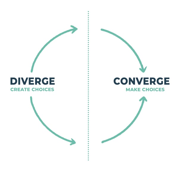
Give your designer a blank canvas at first. Give them permission to go as far out as they please and explore any road that might lead to the end goal we have identified after talking to our users. We call this phase divergent thinking. Allow it as much time as you can afford. Timebox it if you need to, and then start the convergent process of focused editing.
By never losing sight of the user, we can rest assured that we’re going to be creating something truly valuable for them, with their needs in mind, not just something that checks the boxes of a requirements document or allows us to simply flex our developer muscles.
In practice, this means LOTS of conversation. Not with project managers or proxies, but with end users as you build.
We love to conduct a particular exercise as we start building the ‘interface’ portion of a data solution: It involves sitting a user down with the tool, without much instruction or guidance, and asking them to try and figure out how to use it to solve a particular problem on their own, and to think out loud as they go.

A nice byproduct of this approach is that it can prevent us from over-engineering a particular solution. While we may be tempted to impress our developer friends with an elegant solution that leverages all the wonderful nuance and capability of our preferred platforms, this process can help you tame that desire and not waste time solving for your own needs over those of the only person that really matters: your user. Humility built right in, by design! I get it, Craftsman gonna craft, but at the end of the day, people don’t think about it as YOUR solution, they really only care about THEIR problem and THEIR solution or tool that you’re helping to build in order to solve it.
While we here at DataDrive have applied these concepts to develop our Human Centered Data™ framework, and the delivery methodologies we use day in and day out, ANYONE can adopt these principles in their own projects, regardless of industry or application.
There are lots of great free resources out there that can be used to learn about human centered design and design thinking, and toolkits that enable you to solve any variety of problems, not just creating awesome data experiences or innovating new products. In fact, teams all around the world use these principles to tackle some of our most pressing social problems. Pretty neat. Now go show your users some love.

-2.gif)
If you’re a data enthusiast, analytics professional, or just someone curious about Tableau’s latest innovations, the Tableau Conference 2025 is your...

Tableau Plus is the new premium offering from Tableau, a leading data visualization and business intelligence platform. It builds upon the...
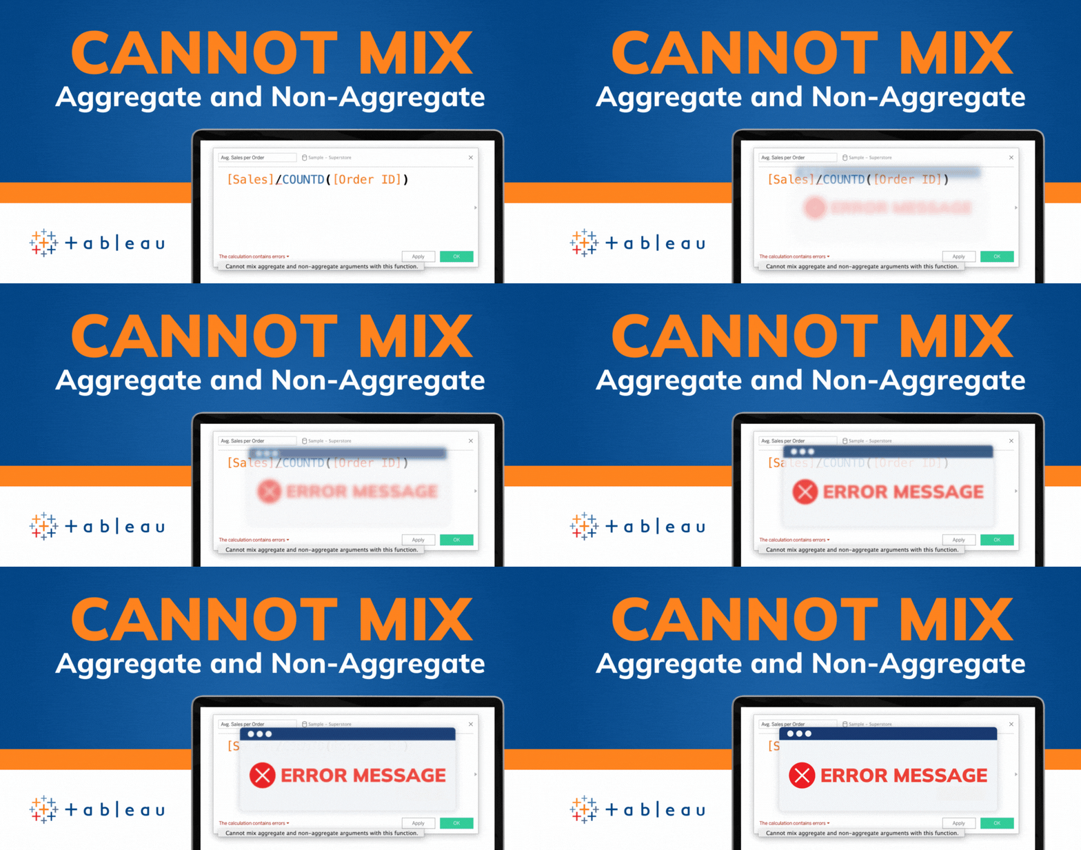
If you've spent any time working with Tableau, you've likely encountered the dreaded "Cannot Mix Aggregate and Non-Aggregate Arguments" error. It's a...